
Overview
Project overview.
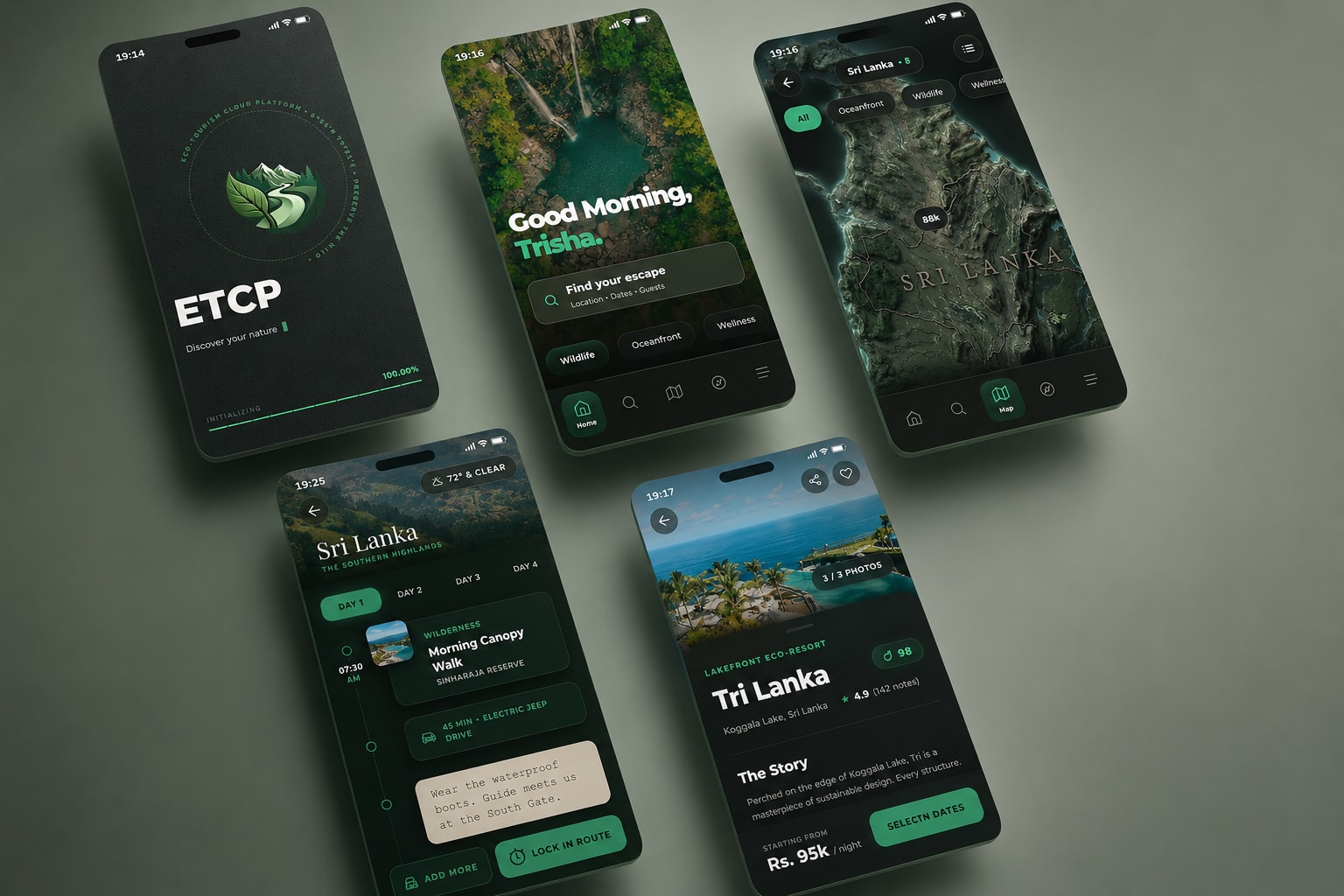
ETCP is a 50-screen React frontend connecting eco-travel discovery, trip planning and provider management through separate but consistent mobile journeys.
Problem
Eco-tourism involves a journey before, during and after discovery.
Travellers need to compare destinations, save choices and organise a trip, while providers need a focused view of listings, availability, bookings and performance.
The product therefore had to feel simple on a phone while still containing two substantial experiences. It also needed to explain its flows without a real backend, payment service or live travel API.
Discovery
Move from questions to a journey, not directly to polished screens.
Research separated essential journeys from decorative ideas. Discovery, bookings, reviews, profiles and provider management became the foundation.
From journeys to screen structure
The hand-drawn sketch helps to plan layout and flow.
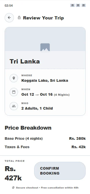
A focused booking flow before visual styling
The wireframe translated the early thinking into a structured screen with clear booking information and a visible primary action.
- Trip details grouped before price information
- Primary confirmation action kept visually distinct
- Content order tested before high-fidelity styling
Key decisions
The most useful iteration changed what the product could do.
Testing first exposed contrast and reachability issues, then revealed the larger missing workflow: turning destination discovery into a usable trip plan.
Separate traveller and provider journeys
ChallengePutting discovery and business management in one navigation structure would overwhelm both audiences.
DecisionI created distinct traveller and provider experiences with shared visual rules but different information priorities.
Why it mattersEach user sees the tasks relevant to them without losing the sense that both sides belong to one product.
State-based navigation across a large screen system
ChallengeFifty screens become difficult to navigate when every transition behaves like an unrelated page.
DecisionI built reusable screens with custom navigation state, route history and animated transitions.
Why it mattersThe interface behaves like a mobile application while the reusable screen system keeps navigation manageable across the full experience.
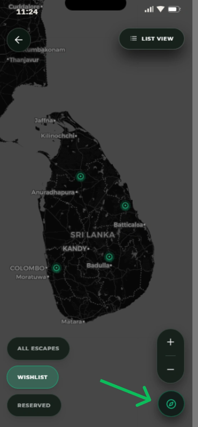
Place the main route action within thumb reach
ChallengeThe original trip-planner action sat high on the screen and was difficult to reach with one hand.
DecisionI moved the action to the bottom of the flow and made it visually clearer.
Why it mattersThe revised position follows the user's reading order and improves one-handed mobile use.
 After
After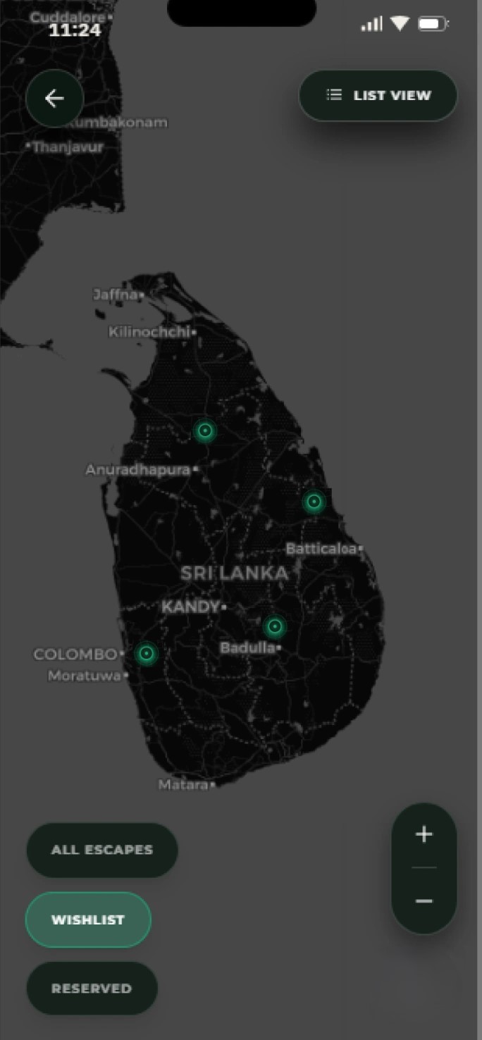 Before
Final solution
A mobile product story that connects discovery, planning and service management.
The final React frontend connects both sides of the platform through reusable screens and realistic end-to-end journeys.
Destination discovery
Search, filters, maps and property details help travellers compare options.
Trip planning
A dedicated planner turns saved places and activities into a usable route.
Traveller activity
Bookings, saved items, reviews and profile screens continue the journey after discovery.
Provider workspace
Listings, availability, bookings, reviews, analytics and payouts are organised for service providers.
- 01
Discover destination
- 02
Compare and save
- 03
Build a trip
- 04
Manage bookings
- 05
Provider updates service
Discovery begins with a focused traveller view rather than a generic marketplace dashboard.
The trip planner became a core feature after feedback revealed the gap between browsing and planning.
The provider dashboard gives the other side of the product a clear operational home.
Activity and progress screens keep the experience useful beyond the first booking flow.
Outcome
A React frontend improved through feedback-led iteration.
ETCP was completed as an interactive React frontend and tested through its main mobile interactions. Its strongest outcome is the visible movement from early idea to feedback-led product changes.
Fifty-screen React frontend
Separate traveller and provider journeys
Sketch and wireframe developed before high-fidelity implementation
Contrast and navigation improved after usability feedback
The best feedback changed the feature set, not just the finish.
The project shows the full movement from research and sketching to React implementation and iteration. The traveller and provider experiences remain distinct without feeling like separate products.
- A polished discovery flow can still miss the user's next task
- Mobile reachability matters as much as visual balance
- Reusable navigation is essential when screen systems become large
KickBlast Judo
A C# and SQL Server desktop system that centralises club records, calculations, dashboards and printable billing.